The following is a guest blog written by Luke Jordan, a.k.a. Strider, the first thru hiker of the GPT. Feel free to post a comment and let us know your thoughts on blazes for the GPT.
For thousands of miles America’s hiking trails wander across ranges and rivers, reaching basically every corner of the country. The 11 National Scenic Trails alone offer almost 20,000 miles of hiking opportunities. First envisioned in the 1990’s, and currently stretching for over 2200 miles from Guadalupe Peak in Texas to the Canadian Border, the GPT seeks to join the list of America’s most prestigious trails.
So how exactly does one successfully navigate these long trails? Anyone who has set foot on the famous Appalachian Trail has undoubtedly seen several of the infamous “white blazes”. The blazes are, at their simplest, trail “markers” to keep hikers on the right path. A traditional blaze is 2” wide by 6” tall and is painted on trees, fence posts, rocks, or anything else available nearby. They can also be found in plastic or metal nail-up versions or as adhesive decals for carsonite posts. A general rule of thumb is a single blaze should be visible at all times to a hiker on a well-marked trail, maybe two depending on the layout. Over-blazing (more than 2 blazes visible from one spot on the trail at a time) is considered overkill and can be classified as form of visual pollution.
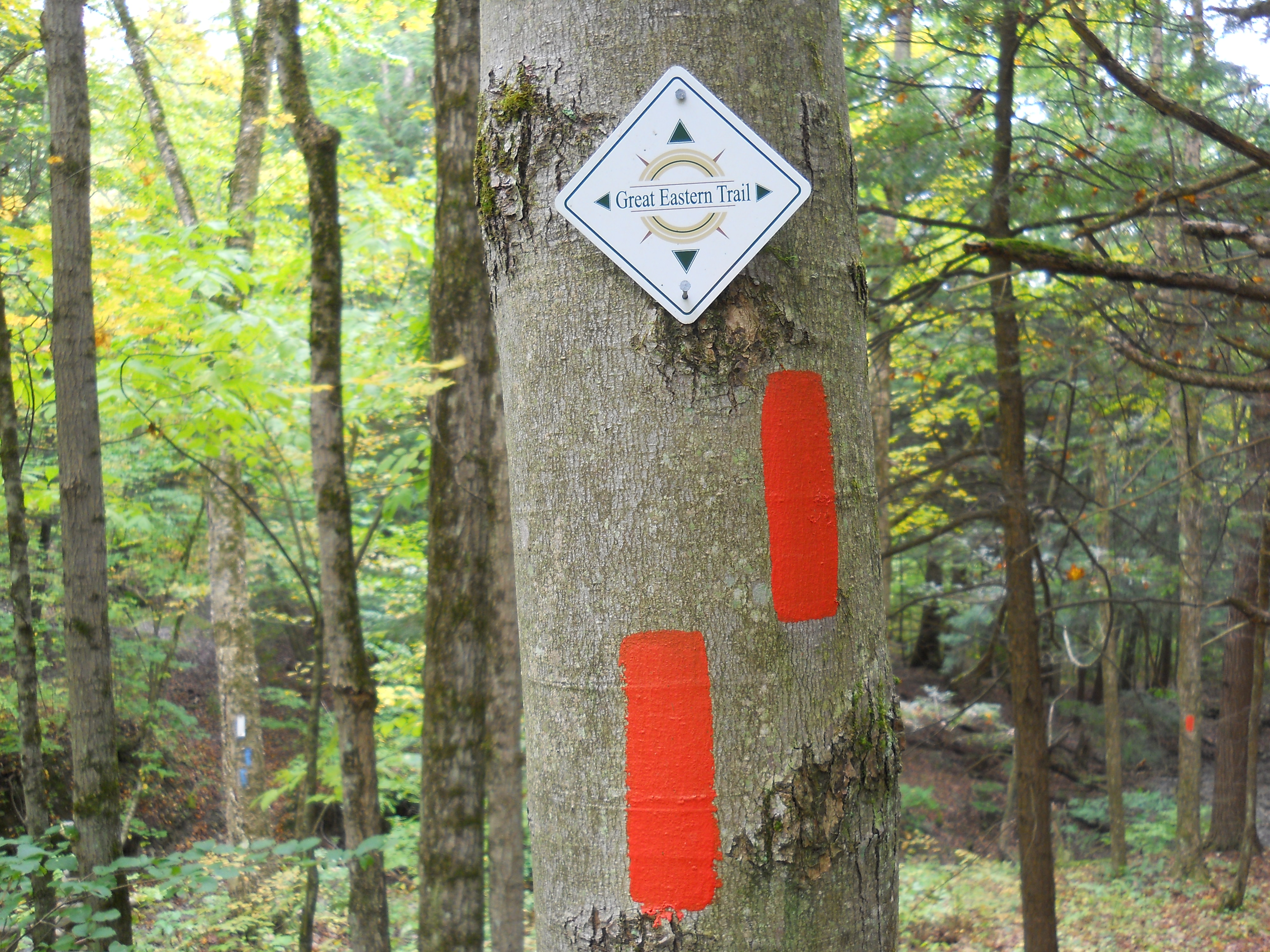
Interpreting the blazes to find your way along a trail is fairly straight forward. A single blaze by itself just indicates that the trail ahead is fairly straight or obvious and you are traveling in the right direction. A double blaze indicates a turn in the trail, with the offset blaze (the top one) indicating the direction of the turn. Two blazes directly on top of each other with no offset just simply means “pay attention”, something about the trail up ahead may not be obvious. Each long trail designates their own color for marking the trail, the AT famously adopting white. Spurs or loop trails often have a common but different color as well, in order to distinguish them from the main trail.
As the Great Plains Trail acquires permission to incorporate existing trails into it’s route, as well as establishing new segments, blazes will start popping up along the route to show hikers the way. The question is, what color will they be? GPTA is currently accepting comments from everyone on what they think the color of the GPT should be. Shall the trail adopt an existing color as one of the other trails? Or shall they select one not yet in existence to make their unique presence known and pave their own way. What color do you think should be used to mark the 2200 mile route through the sub-arid shortgrass prairie ecosystem of the Great Plains?
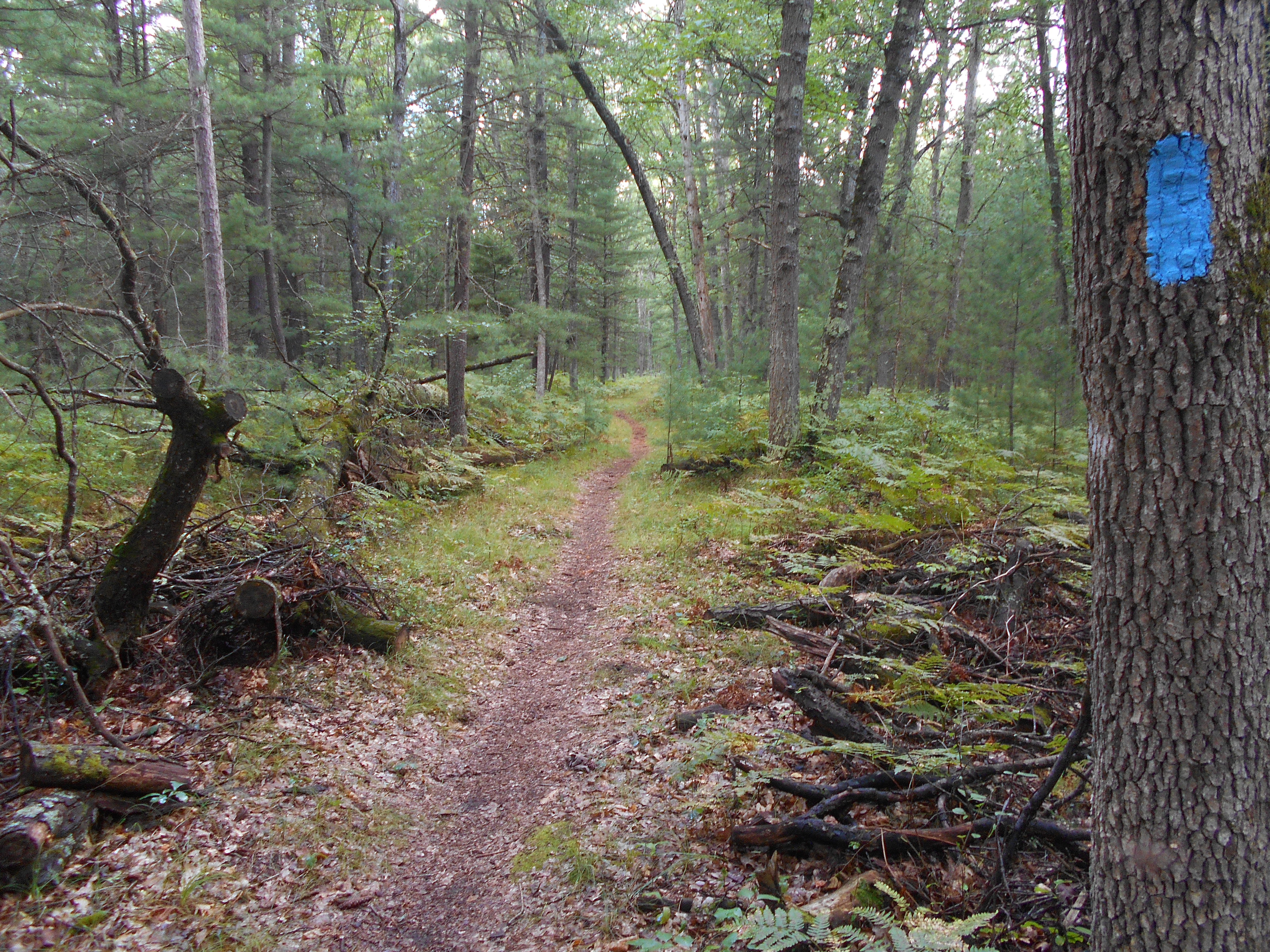
The blue blazes used on the North Country Trail
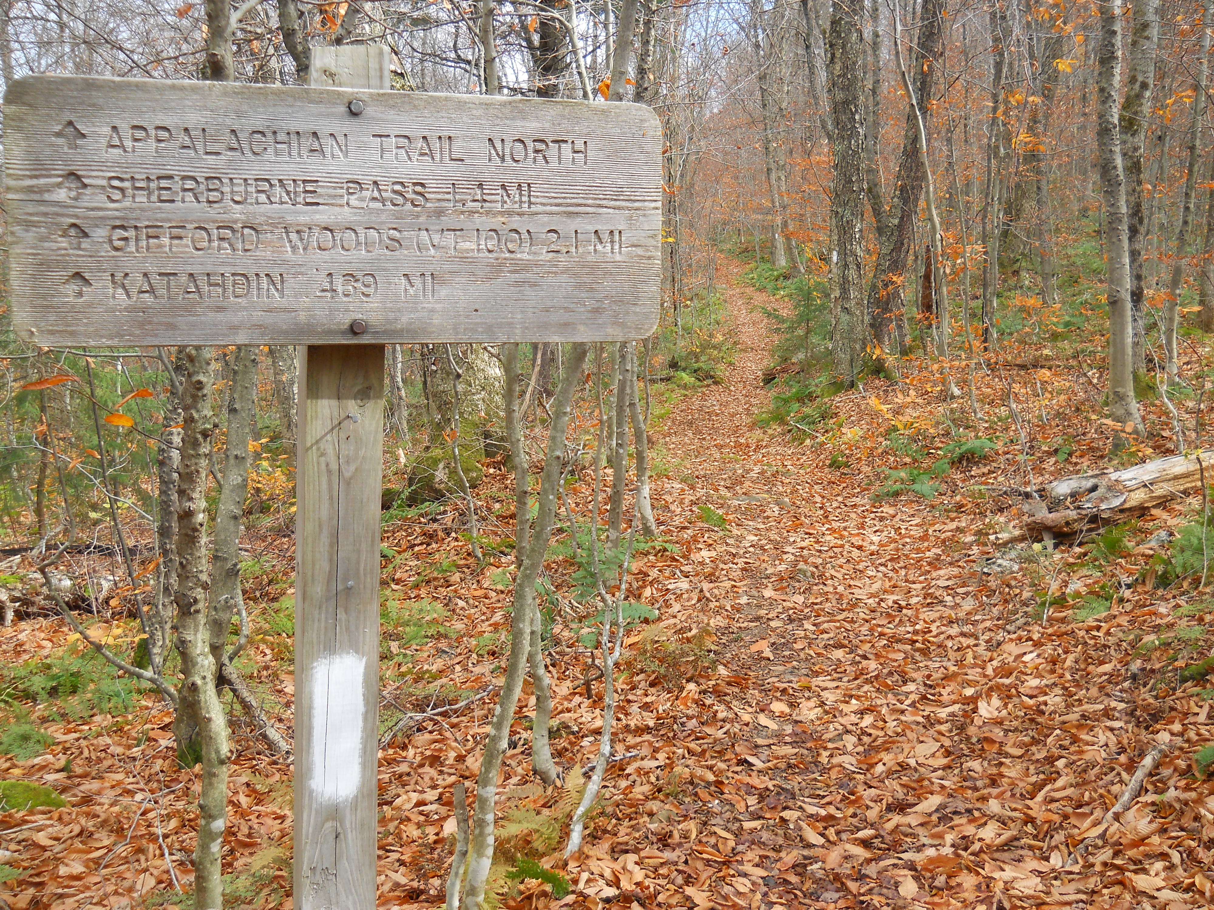
The white blazes of the Appalachian Trail
An example of a directional blaze, the top blaze is off-set indicating a right turn.
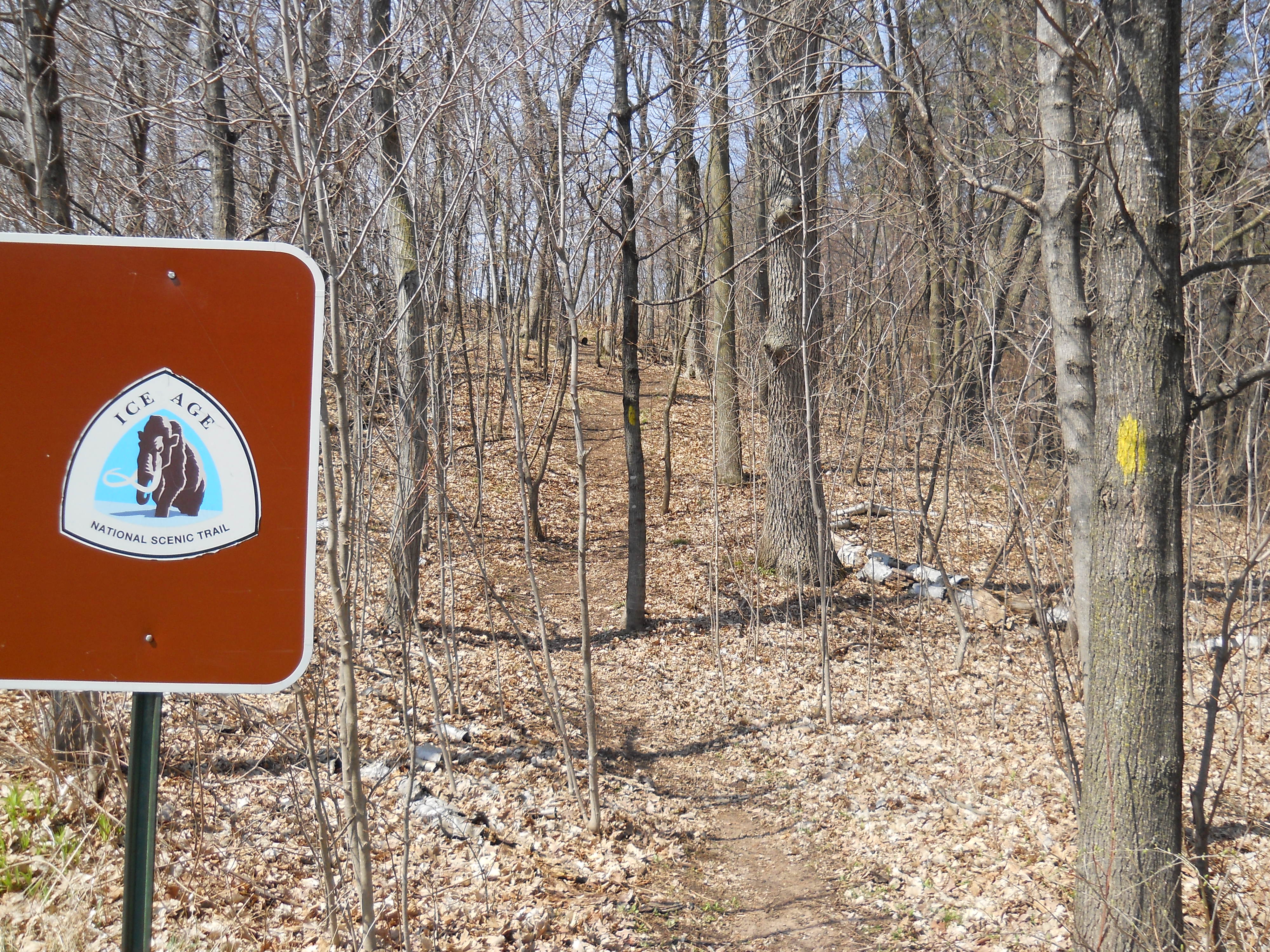
The Ice Age Trail uses yellow blazes.


7 Responses
Excellent informational trail article. I’ve been hiking for over 50 years and didn’t know a lot of that information about trail blazes. Thanks Strider!!
I’ll suggest the blazes be one of the colors in the logo of the GPT. Perhaps the light blue to signify all the sky that’s visible when you’re in the plains.Blue is also a very colorfast color and is less likely to fade such as red or orange.
I would definitely suggest not using red or orange, unless the paint is retroreflective. Not everybody night hikes, but those colours disappear fast in low light. When I was hiking the Pennsylvania Mid-State Trail I once went a mile down a red-blazed trail where the orange-blazed trail had made a turn, even though I was mindful of the turn coming up. The trail was on a wide abandoned roadbed, with a single track down the middle and the rest covered in stinging nettles, and not until the single track veered to one side where there happened to be a blaze could my headlamp show me that it was red! I’ve also confirmed with colourblind folks that a red or orange blaze is very difficult for them to see at any time, especially when the paint is of the same luminance of the surface on which it is painted.
Good thoughts. Thanks for your input!
I will add a not serious suggestion. I have always heard the expression as What in the Blue Blazes? Based on my history, I think that the blazes should be blue. Incidentally, there is an interesting and amusing discussion of the word ‘blazes’ here: http://www.word-detective.com/2011/03/blue-blazes/.
Well my first thought was that a wheat color would be the most suitable, but after reading some of these comments, blue also seems a good choice, to emphasize the wide blue sky.